Competitive Analysis
Brand Audit
Retail Audit
Brand Architecture
Packaging Rebrand
Logo Refinement
PAÑPURI
BRAND REPOSITIONING
REPOSITIONING A WORLD CLASS SPA + WELLNESS BRAND
The Challenge
The established brand architecture at Pañpuri, was a little confusing for current customers. The task was to refine and unify the Pañpuri Bath & Body and Hair Care product collections.
Solutions
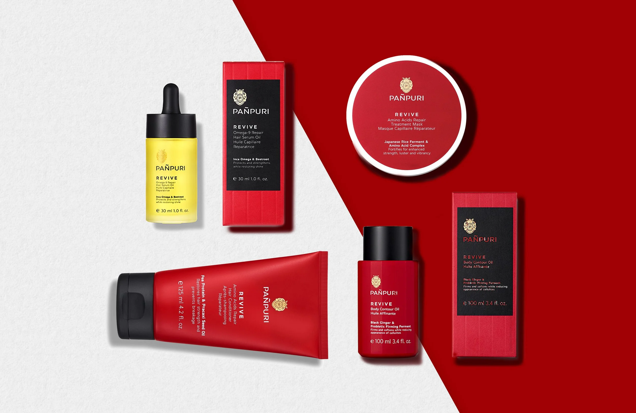
We wanted to re-think and create a more consistent, cohesive, and luxury experience with more substantial brand presence and future line expansions. The audited brand strategy revealed clear indications that consumers recalled the crest logo, faceted packaging, and key colors, which are the areas we focused on.
COLOR PALETTE
Each regimen was identified with a color connecting with the personality and associated product benefits. The colors define each differentiated product lines.
LOGO
Through careful simplification of Pañpuri’s original crest logo, while maintaining the overall brand aesthetic, it improved the reproduction quality for smaller size and wide range of media.

PACKAGING
While the current facets of the bottle didn’t change, the caps became all black to unify the brand as a whole. The labels transformed to fill the full width of the front, using minimalist font combination so the color would dominate and identify the individual product lines.


Company: Pañpuri www.panpuri.com
Design Company: MSLK www.mslk.com
Design Director: Sheri Koetting
Client: Pañpuri
Design Team : Silvia Lambarri, Ryan Nussbaum


